
R语言学习1–数据可视化
ggplot2绘图基本概念
ggplot2绘图是以“图层”的形式逐层进行绘制的。一般的,绘图时用ggplot()函数定义所用数据集和坐标,确定底图;geom_point()或者其他类型图对应的函数绘制图的主体;geom_smooth绘制趋势线;labs更改图的风格,颜色,坐标名,图例等。
示例:
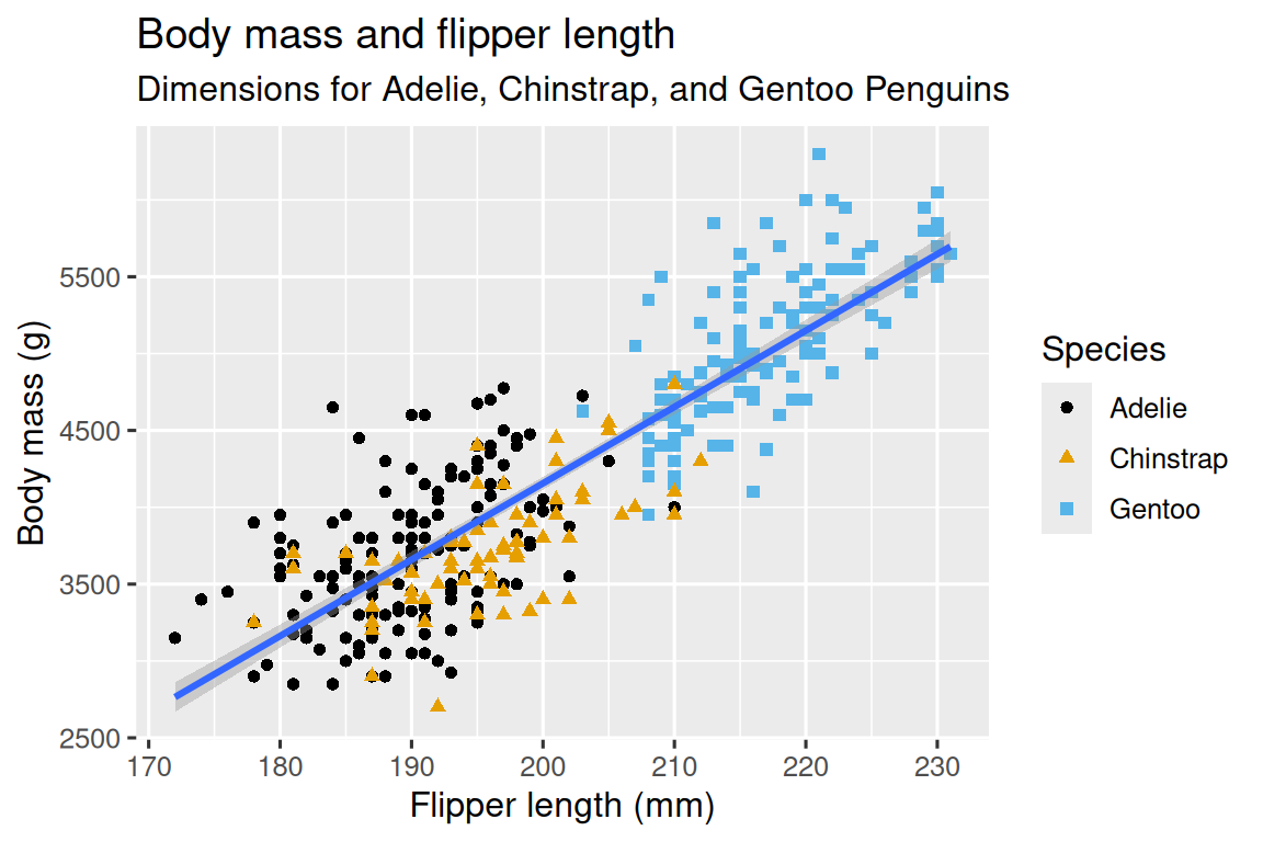
ggplot(
  data = penguins,
  mapping = aes(x = flipper_length_mm, y = body_mass_g)
) +
  geom_point(aes(color = species, shape = species)) +
  geom_smooth(method = "lm") +
  labs(
    title = "Body mass and flipper length",
    subtitle = "Dimensions for Adelie, Chinstrap, and Gentoo Penguins",
    x = "Flipper length (mm)", y = "Body mass (g)",
    color = "Species", shape = "Species"
  ) +
  scale_color_colorblind()
可绘制出下面的图像。
- 注意mapping的定义域:若在最开始的ggplot中定义某些参数,则会全局mapping该维度,可能会影响趋势线等。
例:
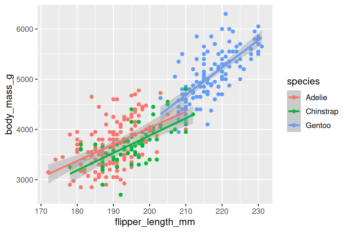
在全局map了species:
ggplot(
  data = penguins,
  mapping = aes(x = flipper_length_mm, y = body_mass_g, color = species)
) +
  geom_point() +
  geom_smooth(method = "lm")
geom_smooth会在全局产生三条趋势线。
而如果只在point图层map species:
ggplot(
  data = penguins,
  mapping = aes(x = flipper_length_mm, y = body_mass_g)
) +
  geom_point(mapping = aes(color = species)) +
  geom_smooth(method = "lm")
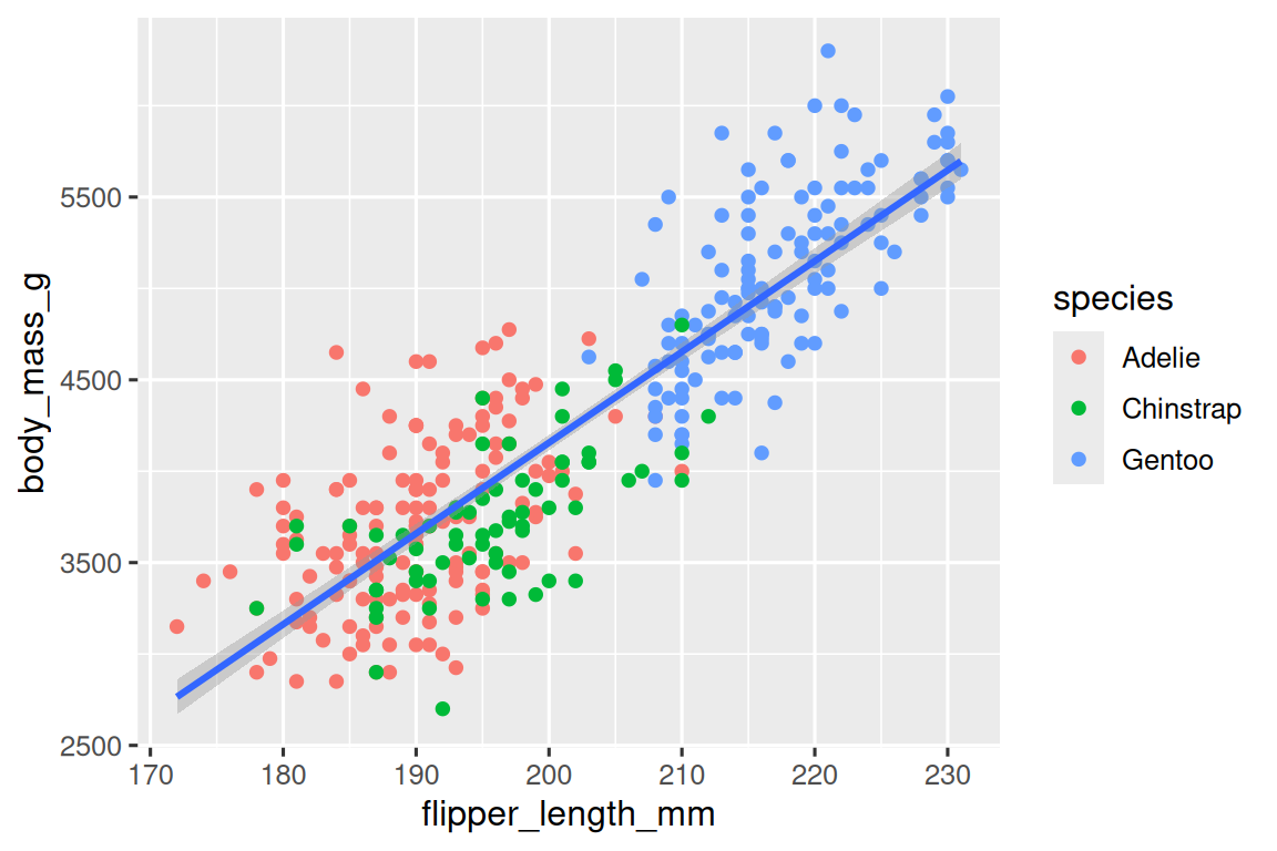
由于species这个维度没在全局map,因此smooth方法没有按照此维度平滑,最终只形成一条曲线。
绘制常见图形的方法
geom_bar()绘制柱形图,坐标使用fct_infreq()可以按照频率大小排序
geom_histogram()直方图,geom_density()频率分布图
geom_boxplot()箱线图,geom_bar()堆栈条形图看比例
facet_wrap()可以将散点图按照某个维度拆分
保存图形
刚刚生成在工作区的图形,可以用ggsave()保存到工作目录。(查看工作目录可以使用getwd())